

My Role:
Creative Direction, Brand Identity, Social Strategy, Concept Development, End-to-End Production, Copywriting

Carlyle Tools
A Case Study on a Legacy Brand of Premium Tools
Background: Named after one of the founding members of NAPA, Carlyle Fraser, Carlyle Tools is the premium line of tools for automotive technicians seeking both quality and style. These affordable, high-performance tools have stood the test of time and fierce competition. While known and loved throughout the industry, Carlyle Tools was long overdue for a facelift as most branding and designs had not been updated since the 90s. With over 7,000 different SKUs, the process of rebranding and invigorating this legacy brand would be a challenge, but one I was willing to face head-on.
Challenge:
Carlyle Tools, previously a sub-brand under NAPA Auto Parts, needed a complete rebrand to connect with a younger generation of auto technicians. Its existing identity no longer resonated, and to establish itself as a standalone brand, Carlyle underwent a full transformation—introducing a new visual system, messaging, and brand positioning. However, the challenge extended beyond the rebrand itself: the new identity needed to be effectively translated into social storytelling and an ongoing digital strategy to engage and grow its audience.
Insight:
A brand is only as strong as the way it lives in the minds of its audience. For Carlyle to successfully reach younger technicians, the rebrand had to extend beyond traditional marketing—it needed a dynamic social presence that felt authentic, informative, and engaging. This meant crafting a long-term content strategy that not only showcased the new brand but also built community through storytelling, product education, and industry insights.
Result:
I co-led the development of Carlyle Tools’ social media strategy and visual identity, ensuring that the new brand identity was seamlessly applied across digital platforms. This included shaping the brand’s voice, designing the content framework, and developing creative recurring concepts to sustain engagement. Through a mix of product deep dives, user-driven content, and industry storytelling, Carlyle’s rebrand successfully translated into an authentic, high-impact social presence—redefining its connection with the next generation of technicians.
The Carlyle Tools Rebrand: Year 1
Some key figures and results following the first year (2025) of Carlyle Tools rebrand:
Generated over $45 million in sales, $10.5 million of which was directly sourced from social media. A Carlyle Tools social post generates on average approximately $220k in sales.
Generated over 4 million organic impressions, as well as 159K engagements through the story-driven and entertaining content pillars across TikTok and IG.
Grew followers for the Carlyle Tools TikTok channel by +10% YoY (‘24 to ‘25) and Instagram by 6% YoY (‘24 to ‘25)
Our top-performing piece for Carlyle Tools gained over 1.2 million views organically.
Maintained a steady 3-5 posts per week cadence to generate awareness and educate consumer base on the new brand identity.

Relaunching a Legacy Brand
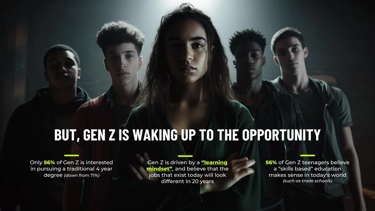
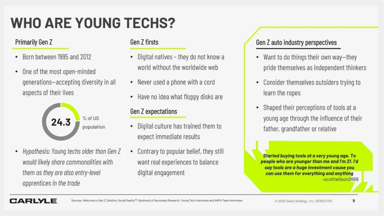
Objective: With the rebranding of this legacy tool line, the new Carlyle Tools had to distinguish itself from the competition. Not only was it hitting the market with a new look and design, the marketing was also shifting to focus in on new technicians, specifically Gen Z, who were interested or just entering the field. In order to generate excitement and capture what it means to be “Built Different,” I led the creative direction and production to capture energetic and stylized content for the rebrand.
Strategy & Execution: In tandem with our agency partners at TVA, we filmed for two days straight at our company owned garage and utilized smoke, lighting, and energetic camera moves coupled with Carlyle imagery and iconography to stand apart from the competition. We wanted the imagery to set the tone that Carlyle Tools is not a brand for your ‘average joe’ or anyone just walking in the store. These tools are built by professionals, for professionals, and the visuals needed to reflect that.
Hands-On Leadership
While some directors may prefer to live in video village and delegate their duties to others, I prefer the hands-on approach and being directly involved with both crew and talent. Making sure that the crew knows where to be and when, that talent feels seen and has a clear understanding of their part, and that catering is always on time is just a few of the many responsibilities I hold.
Content Strategy & Execution:
To establish a cohesive and engaging social presence for Carlyle Tools, I led a multi-disciplinary brainstorm to develop a structured content strategy that would reinforce the brand’s new identity across key platforms. The core of this strategy was balancing consistency, education, and brand storytelling, ensuring that product content remained the foundation while also fostering a sense of community among technicians.
Content Approach - Bringing the Brand to Life:
From this strategy, we launched a suite of recurring content series, including:
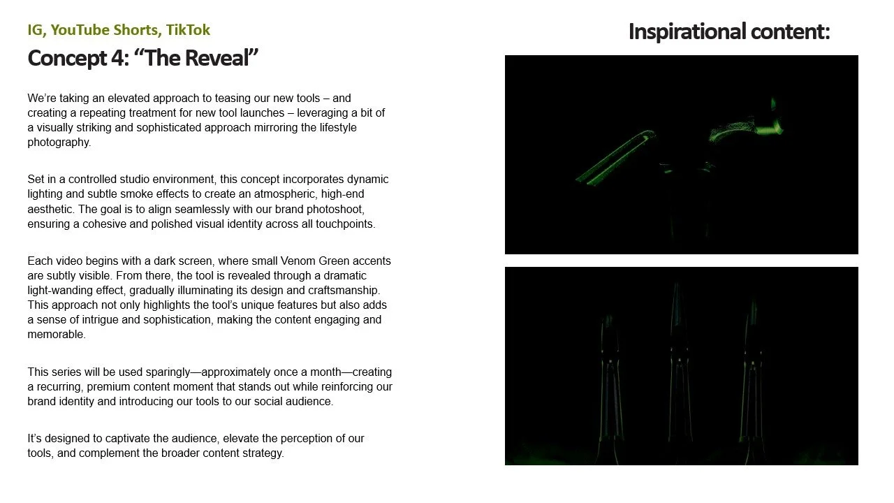
Product Features & Tool Launches – Highlighting the best of Carlyle’s tool line with a focus on durability, unique features, and design craftsmanship. We introduced a premium product showcase series, leveraging dramatic lighting and the brand’s signature Venn and Green accents to visually elevate the tools, reinforcing their quality and positioning in the market. This series was designed for limited but high-impact usage (1-2x per month) to create a sense of exclusivity.
Color as a Way-finding Element – The rebrand introduced bold colors, and we leaned into this as a transformative visual storytelling device, ensuring Carlyle’s signature hues were used to guide focus in content, making tools instantly recognizable. Additionally, the bright Venom Green helps automotive technicians to more easily see their tools in low light environments.
Behind-the-Scenes Durability Testing – To emphasize toughness, we developed content showcasing real-world stress tests, from tools under extreme pressure to more playful durability tests (e.g., throwing them against a wall) to demonstrate their superiority over competitors. This raw, dynamic content reinforced the brand’s reliability.
Shop-Wide Toolbox Trends & “Shop Talk” – Exploring how technicians organize their work spaces and what tools they prioritize, fostering organic discussions around tool preferences and industry trends.
Mentor Motivation & Community Insights – Encouraging engagement through personal stories and shared experiences, featuring insights from seasoned technicians on what they wish they had known earlier in their careers and advice for the next generation.
By developing a structured, yet flexible content framework, we ensured that Carlyle Tools’ social media presence remained visually cohesive, educational, and community-driven, bringing the rebrand to life beyond just aesthetics. By aligning creative storytelling with a structured execution plan, we successfully transformed Carlyle’s social presence into an engaging and value-driven platform for the next generation of technicians.
Leaning Into Trends & Humor
While communicating the features and benefits of our products is the core of our strategy, it is important to remember that social media is, at its heart, a place for authenticity and humanity. Communicating that while we are a brand that ultimately has a product to sell, we are also people who have a sense of humor and interests outside of our products is vital to our strategy.
The Lizard Trend
Tapping into a major trend like the Lizard pressing the button is an important part of our strategy to leverage education and entertainment to drive brand presence and recognition among Gen Z.
Musical ASMR
While many trends have a rapid rate of decay, some are more evergreen such as ASMR. Leaning into these trends has helped to increase Carlyle Tools brand visibility and has significantly boosted overall engagement across platforms.
Lifestyle & Humor
While many not within the industry have preconceived notions of what automotive technicians and blue collar work culture are like, tapping into humor and poking fun at certain old or outdated trends has helped to boost how relatable the Carlyle Tools brand can be.


A selection of high-performing TikTok videos as of May 2025.
INTERNAL POSITIONING VIDEO: When Carlyle Tools rebranded, some independent store owners (ISOs) pushed back, unsure of the change. This issue was exacerbated in part due to NAPA leadership’s recent initiatives to close under-performing company-owned stores as well as shift the current store ownership distribution towards a 50/50 split of company-owned and ISOs. To address their concerns, we created a five-minute internal video that clarified the rebrand purpose and long-term benefits. I shot, produced, and edited this piece, ensuring a clear and compelling message, as well as collaborated with Amber Wilburn and the senior stakeholders within the Carlyle category team on scripting and messaging.
Details in Creative Direction & Story Boarding


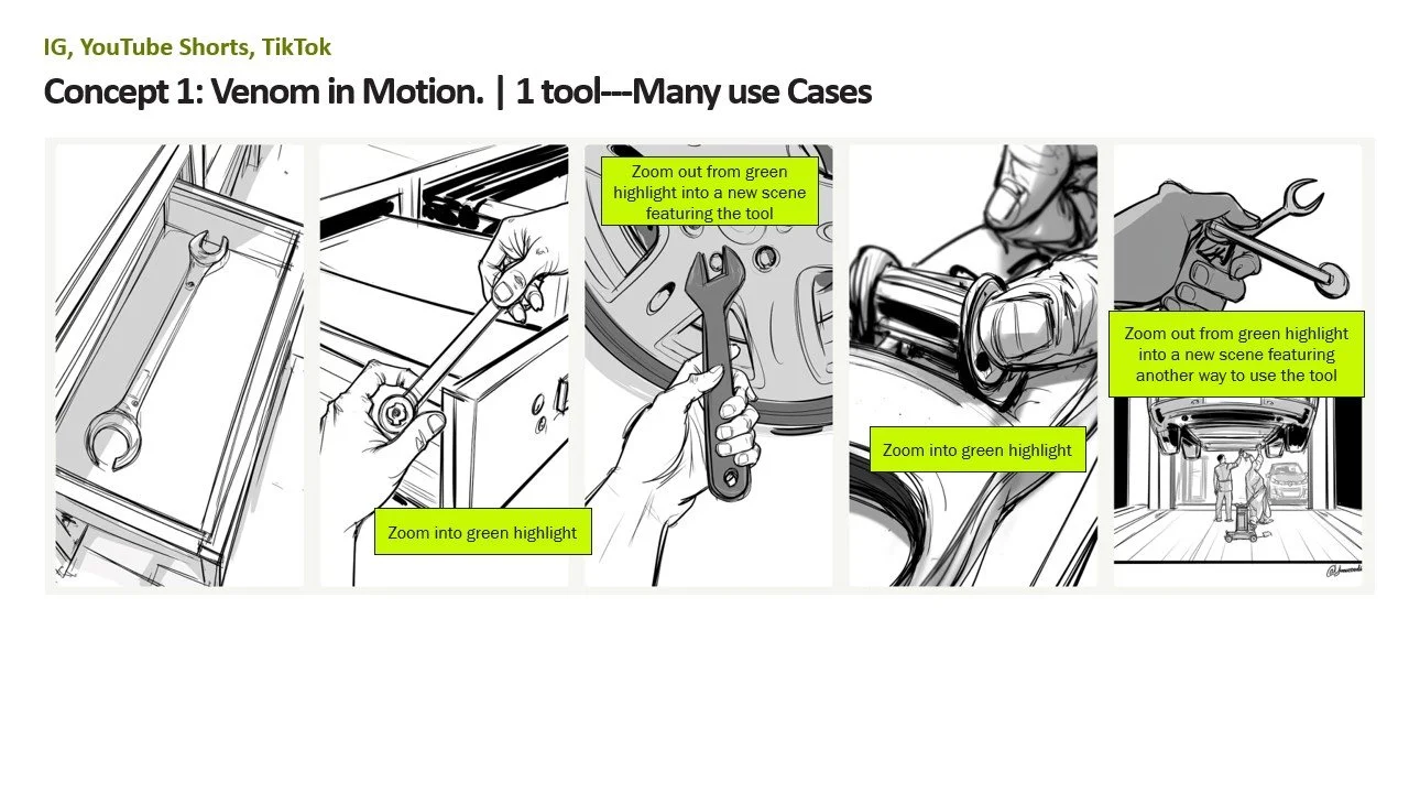


AI-Empowered Storyboarding


